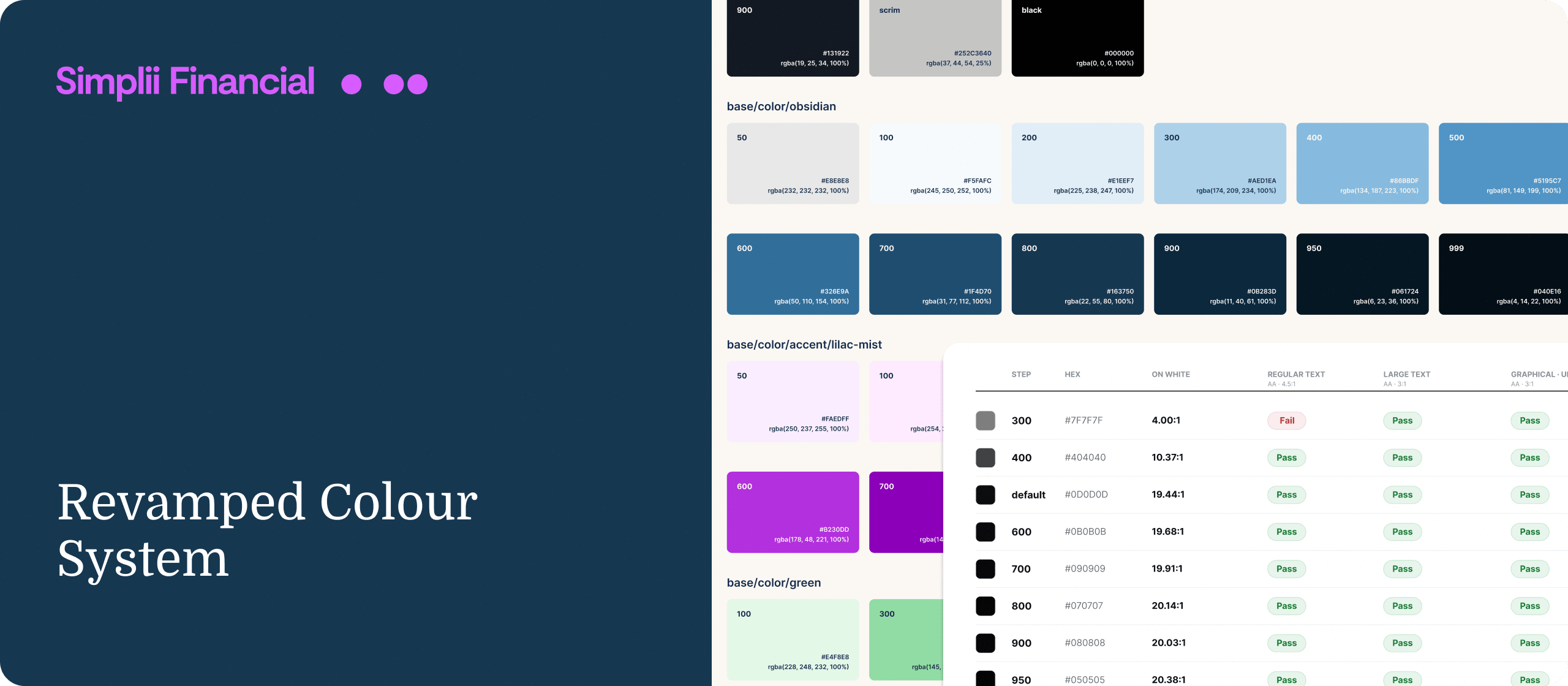
Revamping Simplii’s Colour System
Tokenizing Simplii’s colour system with a focus on scalability and accessibility from the ground up
- Scope
- Role
- Platform
Problem
How can we consolidate all our colours into one cohesive colour system with clear, defined roles - and set it up to absorb an upcoming rebrand with little to no breaking changes for in-flight work.
Outcome
I built a tokenized colour system on an OKLCH scale with accessibility built-in, designed to absorb the upcoming rebrand with no breaking changes.
Context
Our colours had values but no meaning. Most were raw hex codes or vaguely named, and there was no shared understanding of what to use where. We had a token called something like black-700 or "almost-black," and nothing told you whether it was meant for text, a background, or a border.
You could see the problem in how the same thing got built in different ways. Body text is one role with one right answer, but it was done two ways depending on who made the screen. Some elements used a primary-text token. Others hardcoded Gray 700 for the exact same text. Same intent, different code, and no way to know which one was correct. Across a whole product, that adds up to a decision problem: nothing said what a colour was for, so everyone decided for themselves, and they all decided differently.
The challenge
The challenge became:
How do we bring all of this into one colour system with clear, defined roles?
Constraints
The constraint made it harder. A rebrand was coming in six months, and we’d be given new brand colours then. The neutrals and functional colours could stay the same, but the brand colours had to be easy to swap with no breaking changes, because newly designed screens for the upcoming complete app redesign were going to start using the system.
I couldn’t just build a palette and deal with the rebrand later. I had to build something that expected a brand change and could take it without breaking.
Goals
- Consolidate colours into one tokenized colour system
- Ensure accessibility is built in from the start and not an afterthought
- Craft a clear and simple naming convention
- Architect a scalable token setup I could edit without breaking changes down the line.
Understanding the current state:
Auditing
I started by pulling every colour we used, across the Figma files and as built in the app, into one place. I also interviewed designers to understand how they were choosing colours and why.
The audit showed the fragmentation I expected. But it also showed something I wasn’t looking for:
- There was no rule behind how the colours were made. Nobody could tell how a shade had been chosen, because the honest answer was “by eye.” Every scale was really just a set of hand-picked colours with no system of rules to how they were derived.
- Both primitives and semantics were exposed and used in UIs.
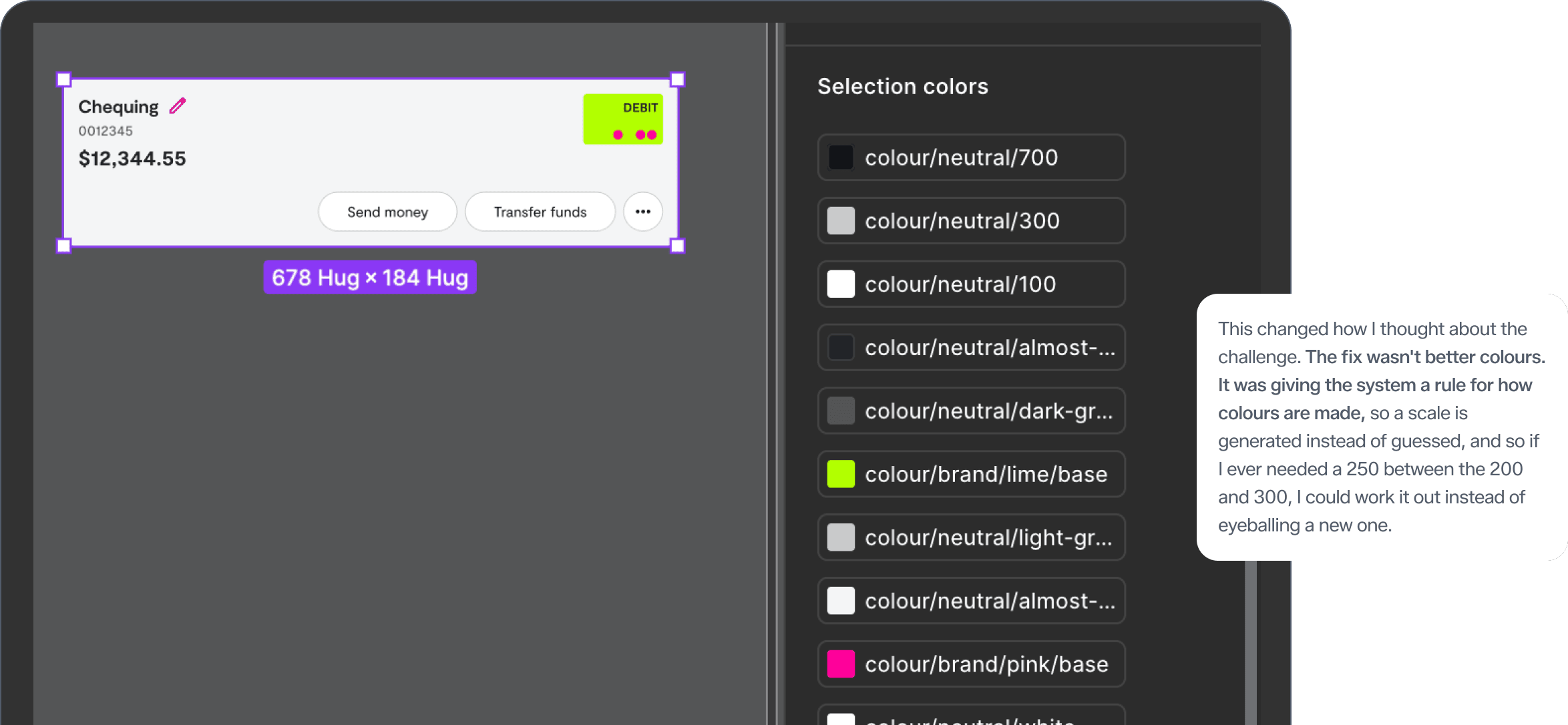
Decision 1:an even scale, using OKLCH
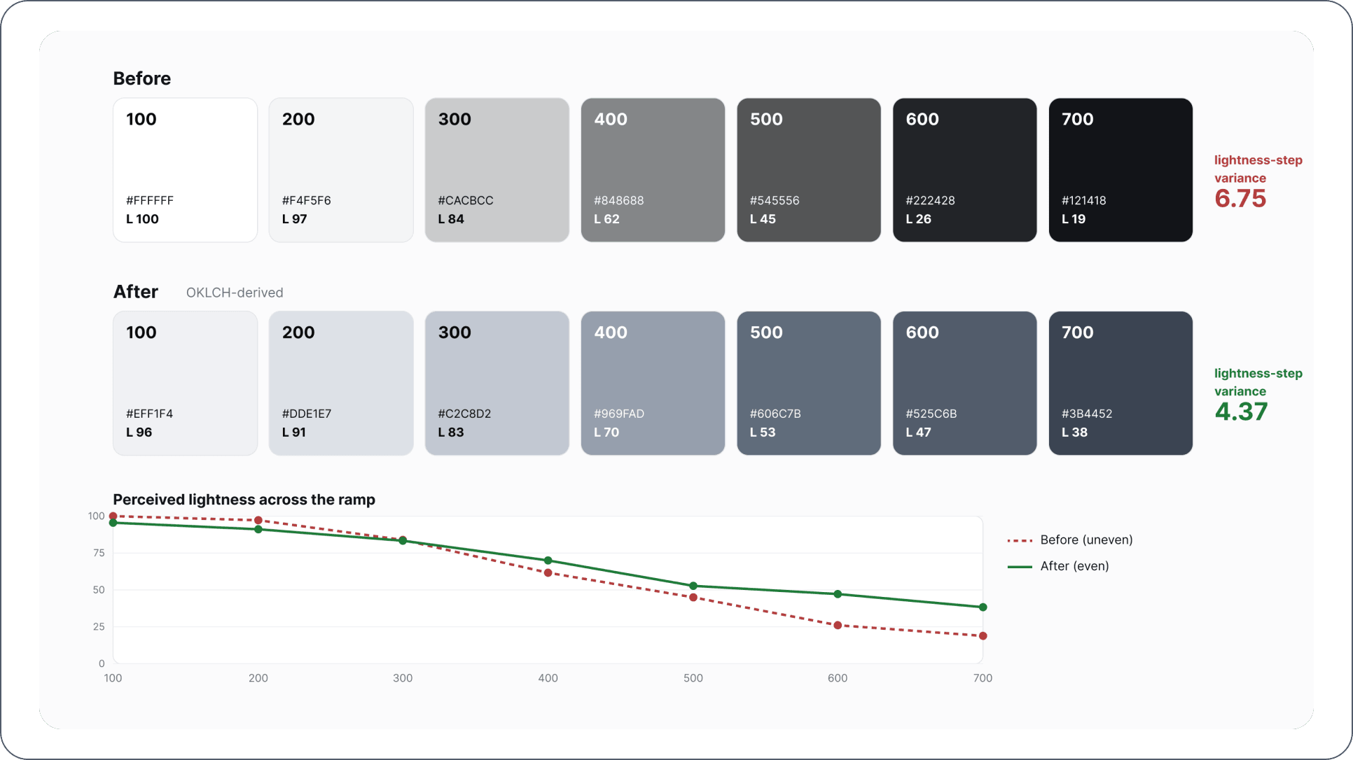
I rebuilt the scales (Neutrals, Gray, Red, Yellow, Green, and Blue) using OKLCH instead of HSL.
The reason is that in HSL, the lightness number doesn’t match how light a colour actually looks, and it shifts from one hue to the next. So an even jump in the numbers doesn’t look even, and a ’500’ in one colour can look lighter or darker than a ’500’ in another. OKLCH fixes this because it’s perceptually uniform: a step in lightness looks like the same step across every hue.
That gave me three things the old palette couldn’t:
- Even ramps that are generated, not hand-tuned. The colours step evenly because the maths steps evenly.
- The ability to fill in any shade in between, like that 250, because the gaps are even and meaningful.
- Contrast that’s predictable across hues. Because how light a colour looks lines up with its contrast, I could set the point where text flips from dark to light at the 600 step for every hue. Shades 100 to 500 use dark text, and 600 to 900 use light text, everywhere.
I made a 100 to 900 ramp for the main colours, and kept the status and functional colours shorter, at 100, 200, 500, 700, and 900, since they don’t need nine steps. And because the new brand colours weren’t ready yet, I used black from the Gray palette as a stand-in brand colour for now. It was a deliberate placeholder the system could swap out later, and a first small proof that the no-breaking-change idea worked.
Accessibility, built in from the start
Before this, contrast wasn’t documented anywhere in the system. The Simplii Secure Library didn’t carry accessibility data, so designers had to check contrast ratios themselves, one at a time, with Figma plugins or web tools. More often, colours just got used in the UI first and checked later, when accessibility flagged something in review.
So I built it into the foundation. Since every colour used on a component comes from this system, getting it right at the source means getting it right everywhere downstream. I picked semantic colours that pass for both text and backgrounds at WCAG AA as a minimum, using WebAIM to test foreground and background colours and I documented the contrast for every step of every ramp directly in the system, so a designer can see what a colour is safe for without leaving the file or reaching for a plugin.
I also worked with an accessibility consultant early, before I locked the scales, for final review.
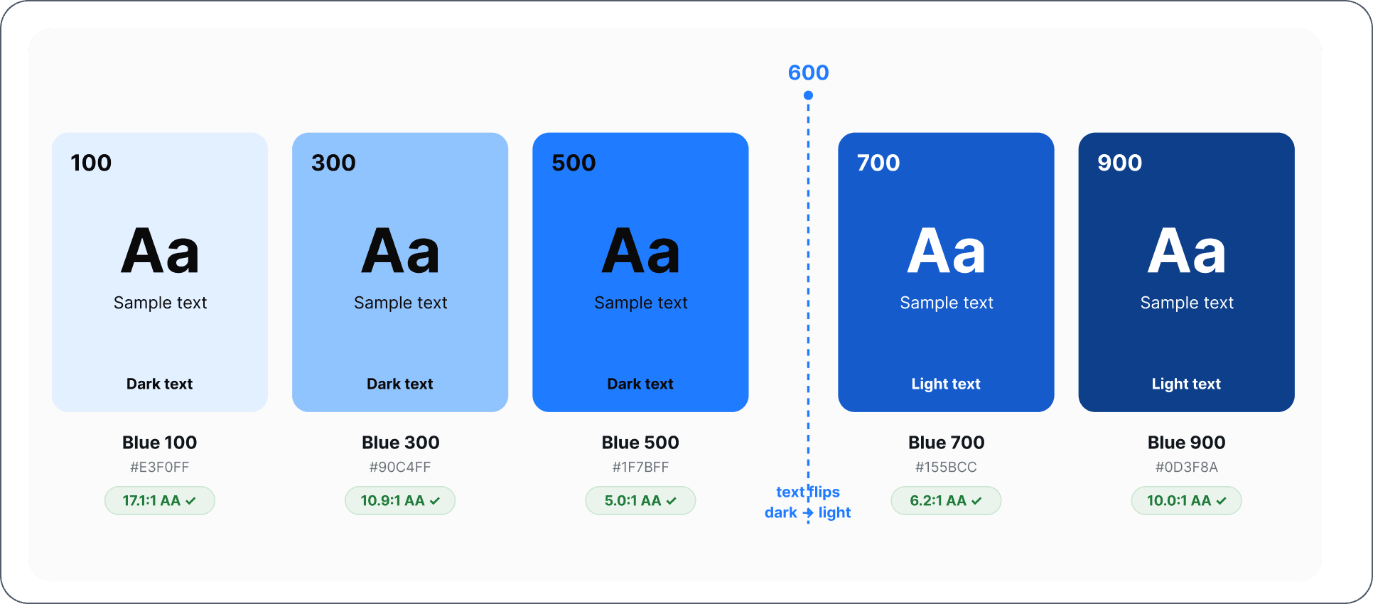
Baked in WCAG ratios for each swatch against dark vs light text
Decision 2:Semantics, not primitives
Once the scales were built, the next question was which layer designers actually use. My manager wanted to expose the primitives, to give designers the full range and the most flexibility when picking colours.
I pushed back, because open access to primitives was exactly what had caused the mess we were fixing. When designers can grab any raw value, they will, and you end up with black-700 and "almost-black" and Gray 700 all standing in for body text. Six ways to say one thing, none of them written down. Flexibility at the primitive level doesn’t give you freedom. It gives you drift.
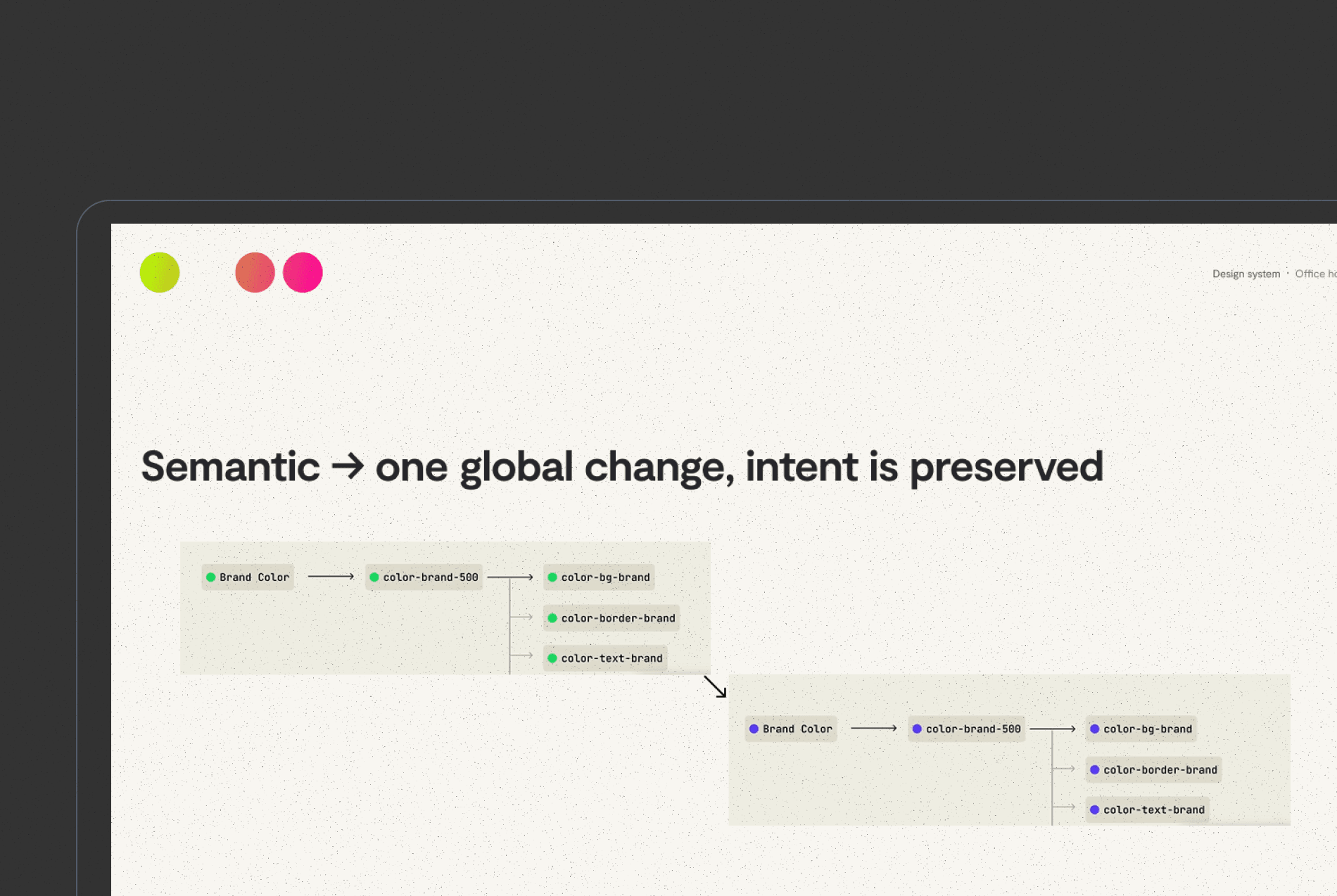
Instead of just saying this, I ran a workshop to show it. I walked the team through how semantic tokens hold their meaning (primary-text always means the body text colour, wherever it shows up) and how the open-primitive approach was the direct cause of the inconsistency they were already dealing with. That got everyone on board with the three-tier setup:
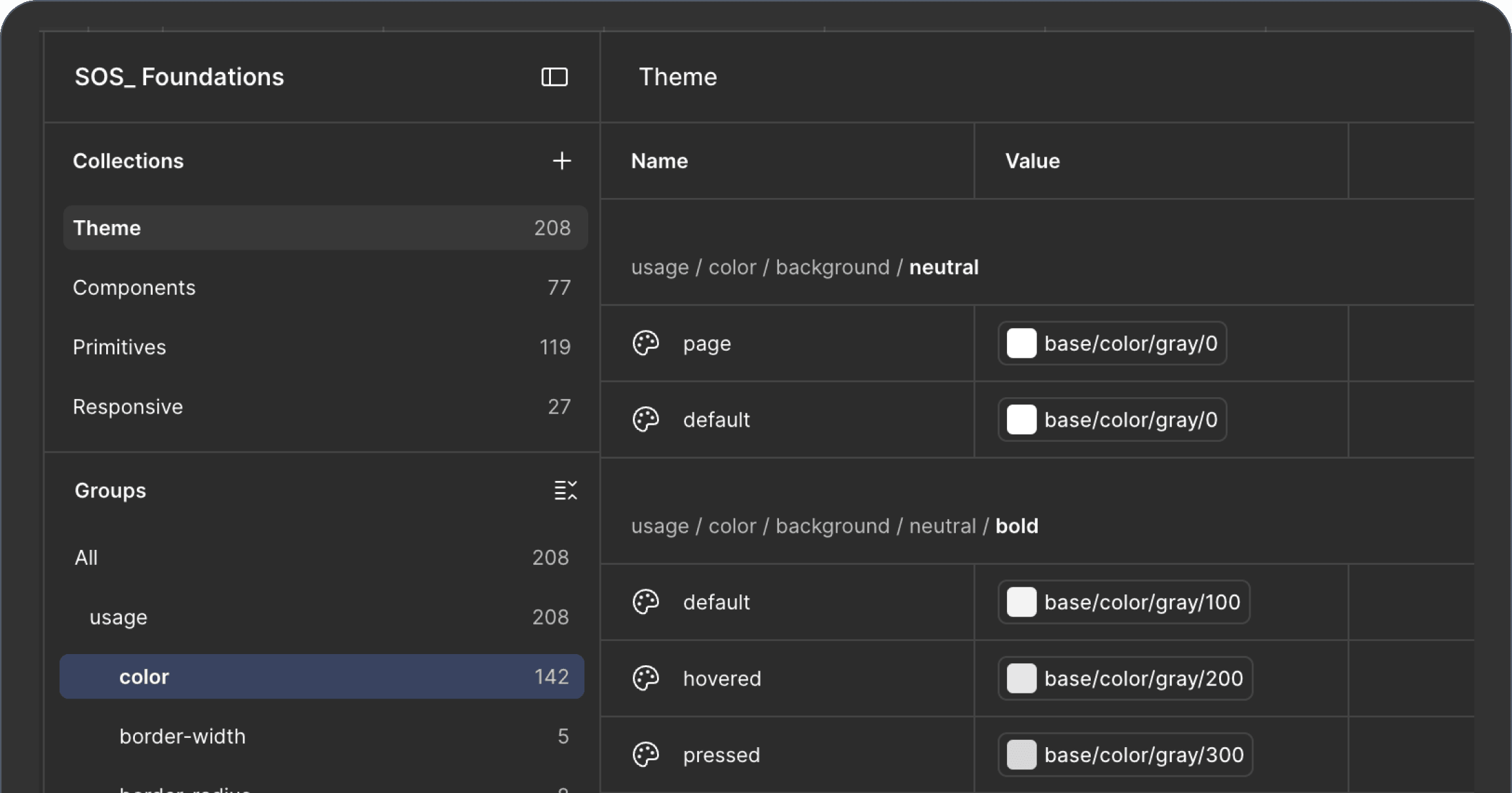
- Primitives — the raw OKLCH values. Never used directly in the UI.
- Semantics — tokens with meaning that point to primitives (primary-text, surface, success, and so on). This is the layer designers work in.
- Component-specific — tokens scoped to a single component that point to the semantic layer, for the cases where a component needs its own treatment.
That third tier is also what will make the rebrand safe. A brand change gets remapped once at the semantic layer, and the component-specific tokens hold the exceptions locally. But that’s the next case study.
Naming, and matching design to code
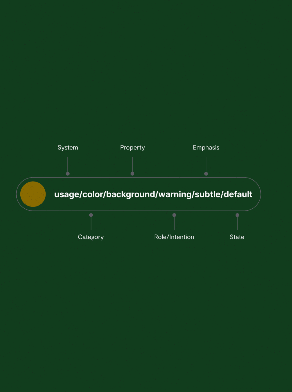
A system is only as useful as its labels, so tokens follow a naming pattern you can read like a sentence: category / property / role / emphasis / state (for example, color / text / primary / default). Each part answers one question: what foundation, where it’s used, why it exists, how strong it is, and when it shows. The point is that you can tell what a token is for without opening any docs.
Getting there meant fixing a gap between design and code that I found while working with engineering. The dev team had a token style-guide library, but it didn’t map to a Figma variables collection. The names weren’t 1:1 between design and code, and there were still a lot of loose hex codes in the codebase. I sat with the engineering lead to line up the two naming sets into one shared vocabulary, then exported the tokens as JSON for the React Native codebase, so design and code finally pointed at the same source of truth.
Outcome
- The app redesign was designed and built on the new colour system. It became the foundation the new screens were built on.
- Design and code lined up. The tokens were exported as JSON and used directly in the React Native codebase, which closed the 1:1 gap between Figma and code and got rid of the loose hex codes.
- Designers could make consistent colour choices no matter which product team they were on, because the semantic layer gave “which colour for body text” one answer everywhere instead of one per team.
Reflection
This project deepened how I think about encoding decisions. The old system didn’t fragment because anyone chose badly — it fragmented because nothing encoded what a colour was for, so everyone re-decided, differently. Fixing that meant building two things that outlast any single palette: a mathematical way to derive colour, so the scale is generated rather than argued over, and a semantic layer, so a colour’s meaning is set once instead of guessed everywhere.
Owning it end to end also taught me that a system isn’t something you hand down — it’s something you build with the people who use it. Much of the real work was listening: learning how people actually reached for colour, where a rule helped, and where rigidity just slowed them down. The semantic layer came out of that balance — enough structure to hold its shape, enough flexibility that it doesn’t feel imposed. And that balance matters more as the system scales, because every constraint I set gets multiplied across more people and products. The question stops being "how do I control this" and becomes "what still works when far more people depend on it than I can talk to directly."
Understanding that the system needed to scale brought to light the need to make encoded decisions cheap to follow and expensive to break. This colour system was built to be edited without breaking, and six months later a full rebrand tested exactly that.